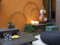
As episode 3 of Design Star begins, our ten remaining designers are dragged to a chilly Trump rooftop where they are greeted by Vern and an instrumental ensemble. As a viewer, my curiosity was piqued as to what kind of design-related challenge could they conjure up with these instruments. We found out quickly enough that the designers were going to be paired up with an instrument as their "inspiration" and then they would have to design a rooftop area with the other members of their team to create a harmonious living space. Since there were more men than women, the ladies got to pick one of the guys to be an honorary teammate. After a few minutes of intense whispering, they played "Red Rover, Red Rover, let DAN come over" and his fate was sealed. They chose Dan because of his construction skills. Stacey and Emily are all giddy about how it is "much more peaceful" with Dan on their team. Translation: they can use him as a "buffer" from having to deal with Nina. He then becomes Stacey's workhorse to build a fence to represent the keys on the trumpet, the frets on the guitar and the xylophone keys. She puts some plants and candles on it and calls it a day.
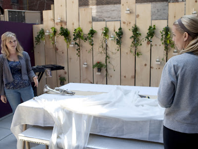
Emily puts together this table, that I did not care for. It reminded me of when I was a child and we would go to Aunt Tina's apartment in the Bronx and they would set their living room up as the dining room in order to fit everyone. This involved moving the kitchen table into the living room, but then they would get the giant aluminum folding table and throw a fancy tablecloth over it to make it look nice for the holidays. That is what this table reminded me of. Nothing special.
On the other side of the patio, Nina was busy. She painted the walls this beautiful purple color. Over the color, she then painted these squiggles to represent the twisted tubing of the french horn, which was her instrumental inspiration. Along comes Emily and tells Nina to paint over the squiggles as she doesn't like them. Nobody tells Nina what to do because Nina is Nina and gets the job done on her own terms and then proceeds to tell Emily that she doesn't like her table either because the scale is off and the fence is not all that thrilling to her. Everyone has their own opinions. And it's a good thing that Nina stuck to her guns because the judges liked the squiggles, and awards the win to the Ladies + Dan Team. Nina is granted the over-all win. So far, there have been three challenges and she's won two of them. To me, Nina seems like she knows what she's doing.
The other one who seems to know what they are doing is Michael. He has been consistent with his design knowledge and experience and has a fantastic eye. His instrument inspiration was the trombone. He creatively used an extension cord wire as art and fashioned music notes, as well as a visual representation for the trombone slide. The judges seemed to like that and I think if the men's team had it together enough to win the challenge, Michael would have been the over-all winner for this one.
However, the guys were all over the place and it showed. Everyone was working on their own project and it didn't mesh when it was time to bring it all together. Our first disaster was with Alex. His instrument was the bongos. He found this beautiful day bed that would have been perfect.....if he had bothered to measure if it was going to fit in the elevator to make it up to that rooftop patio. (My question while watching this was wasn't there a freight elevator in the building? Stairs?) The piece did not make it and they had to come up with "plan b". Plan b was not so great. Tom decided to help Alex and they designed a day bed which was nice, but didn't say "bongos" and certainly didn't look as nice as the original choice. Instead he ended up with these blue round ottoman pillows that although they were blue like the bongos, they missed the mark.
Disaster number two was Courtland's decision to Venetian plaster the wall to match the color of his cello. The wall ended up being this pumpkin pie orange-y color. All I kept thinking was that I wished I could call on Casey because she would know the answer to this one: If yellow is an aggressive color, then what is orange because it certainly did not give me the relaxing "Sedona Arizona" feeling that Courtland got from it!
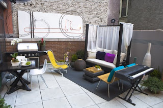
The death knell for the gentleman's team came from Trent. Scott Adams, who created the "Dilbert" comic strip coined a phrase for people that work in an office that do not work as hard as their co-workers. He referred to them as "dead weight, pretending to be contributors." This is the best phrase I could use to describe Trent and I'm glad he went home! From the little bit that we got to see from him, all he did was make a big fuss about how he wasn't the type of person to argue or make a big fuss about himself or his ideas. It showed. When he signed up for a reality show competition, didn't he realize that he would have to confront and deal with other people? His instrument was the keyboard, so he selected the barbecue grill as his design element because his thought process interpreted grill = party. The judges didn't agree and weren't impressed. He also got lost in his video presentation. I don't think the whole Design Star experience was a good fit for him! Alex remains for another challenge and we move on to a flower-related task for the next episode.
I'm not sure if we have a new episode Sunday because it's Fourth of July, but either way, I'll have my DVR ready to go.
The DVR Diva
Tuesday, June 29, 2010
Wednesday, June 23, 2010
A No to Yellow
Sorry for the delay in posting, folks. It was the last few days of school here this week and there was all sorts of craziness going on. I'm done before episode three is shown, so I'm still good!
Design Star Week 2 Recap: Battle of the Sexes. (The Women's Team had their own private battle, but let's not jump ahead.....)
The challenge this week was based on fashion. The designers watched a runway show of a unique collection of clothing. (Wouldn't it be the ultimate reality tv high if networks could get along and they used the fashions from Project Runway and then the judges had to work together to have a massive judgement of EVERYONE? People think Nina Ferrer is mean? I bet that Nina Garcia could rip Vern a new one before you could even say "Garanamals"!--But I'm fantasizing..back to Design Star!) Then each contestant selected their favorite fashion inspiration and create a room based on the outfit. But we know there is ALWAYS a catch, and this week's catch was that they would divide into two teams - Men vs. Women.....AND they had to design an apartment based on EVERYONE'S fashion selection combined.
The men seemed to be at a disadvantage on this one because Alex chose this ginormous fuffy wedding dress that was going to be hard to put together with anything, but bless these guys because they managed to pull it off by placing it in the bedroom with Dan's choice of these cute pink print pajamas. For the most part, the men seemed to be working well together. On paper, Alex had a wonderful concept for the headboard in the bedroom based on the wedding gown. When it came time to execute it, however, he proved that he was not a friend of the power tools and measuring and cutting. Dan seemed to come to Alex's rescue and help him out with this task. The other little glitch on the guys team was Trent. Trent did not seem like much of a team player for this one. The only thing he seemed to do was pick out these terrible wooden palm frond accessories (which Vern hated) to correlate to his Tommy Bahama outfit. He then seemed to space them out oddly around the room. Thankfully, Michael came to his rescue and repositioned them in a more attractive setting because they really did look bad the way Trent had placed them. Then Trent got all annoyed at Michael. That was pretty much all that Trent did to contribute to this challenge.
Michael sizing up the room
But the knight in shining armor for the men's team is Courtland. He paints a striped wall which incorporated a color from each of the outfits. For this he ends up being the winner of the challenge.
The ladies don't have such an easy time with this. From the get-go, there seems to be friction. Tera, Casey and Nina show a maturity and a willingness to function as a team. Stacey and Emily seem to be more resistant and while they are good at protesting ideas that they don't like, they are not offering any alternative ideas. They go rug shopping. Nina finds a rug that she thinks will bring the room together nicely and incorporate the fashions featured for the living room. Emily and Stacey want to wait and not buy the rug. They seem to think that they are on a leisurely shopping trip and forgetting that they are in the midst of a challenge. Tick, Tick, Tick - clock is running, girls!! Nina is all "This rug will be perfect! Beautiful!" They want to wait and see if something better will turn up. Nina keeps selling them the rug. This is where the waters will part around Nina. Some of you will agree with Emily and Stacey that Nina is "a bully" and doesn't let anyone else say anything. The rest of you will see that this is Nina's way. She's a Brooklyn girl and she's a very driven, competetive and determined woman. No one steamrolls over her. She wants to win this challenge and this competition and if her team mates don't have the chops to step up the game and run at her pace, she'll leave them in the dust. Stacey and Emily back off and let Nina buy the rug. (And of course, I also happen to think that the classic double standard goes into play here. Just for the sake of being the devil's advocate, let me say this: If Tom said the exact same things that Nina said when trying to convince her teammates to like the rug or to let her paint the mural on the living room wall, he could be called "assertive" and "confident in his style" because he is a man. When Nina says this stuff, she's called a bully and a witch with a "b" and I don't think that's fair!)
Their living room comes together nicely. I have to say, the rug really does bring the room together. Their downfall was the bedroom. The judges did not care for the butter yellow walls in the bedroom, which was Tera's decision to go with because it matched the outfit that she had chosen. Casey could get a giant "I told you so" here because she tried to explain that when she took color theory, yellow is actually an aggressive color. Tera decides to go with her heart and keep the color. She eventually gets sent home for this. The judges tell her that taking a color from a fashion and putting it on the walls is not enough to win a challenge. Um....OK, but isn't what they gave Courtland the win for? He took the color from each of the outfits and painted a stripe on the wall. Is it me or are the Judges all over the place here? The other person who ends up in the bottom two is Nina. The Judges aren't happy with her mural. She dodges the bullet and they end up sending Tera off, which I think is unfair. If you ask me, Stacey should have been in the bottom because she spent ALL STINKING DAY painting one chair. But the judges liked it. In fact, during the HGTV Twitter party for Design Star, Genevieve Gorder herself tweeted "I dug this Stacey chair, but a chair all day? Um, Not on my team, lady."
So the show ends. I head upstairs to my computer to see the HGTV Blog and find out what Heather "Dooce" Armstrong has to say. I didn't agree with her, but that's what makes our great world go 'round. She thought Michael was "nitpicking" Trent when he was rearranging the items that Trent had placed at far apart intervals on the windowsill. It reminded me of how you'd put an electric socket so many feet apart to meet the building code standard. Trent's style had no life to it. I say thank heavens for Michael because it looked better after he touched it! Then, what I really didn't like was that Dooce said that she wanted to spill her beer all over Nina's head to make her shut up. Really? This is the person HGTV has representing them? I understand that a certain amount of "smack talk" gets done around these reality shows, and the beauty of having your own blog is that you can say anything you want. However, I feel when you're writing a blog on behalf of a network, you should be, perhaps, a smidge more professional when critiquing the contestants on one of your network's hottest shows. Just sayin'.
So then the next morning, the amazingly talented David Bromstad (who I happen to love) puts up his video blog (or "vlog") to review the episode and jumps on the Dooce bandwagon and says that he not only wanted to pour his beer over Nina, but that he wanted to throw another one at Tera's face for her choice of yellow. *Sigh* I know we have exaggerated drama on the screen, but I think the throwing beer thing is really sad. The other thing that Mr. Bromstad said that made me go "What?What?" He said that he thought that Emily did a good job of taking her outfit and translating the look into the room. He said it looked fabulous. Um.....yeah....It did look fabulous with the rug that Nina picked out that Emily didn't want her to get in the first place!! Go figure!!
So yes, folks, we are all about the drama for this season on many levels!! I am so glad we have the whole summer to enjoy this!!! I can't wait to see how next week's challenge comes about. Rooms are supposed to be designed based on a particular music instrument or something? How are our design stars going to do THAT??? I have never in my life heard anyone say "I think I want to do my bathroom over in Oboe...." Can't wait until Sunday!! The DVR is already set!
p.s. - If you're looking to get a the inside scoop from the ladies team, Casey Noble gives a peek of what it was like on her blog:
Friday, June 18, 2010
Hot In Cleveland
Hot In Cleveland is the first ever original sitcom to air on the TV Land network. It is the new vehicle for Valerie Bertinelli, Wendie Malick, Jane Leeves and Betty White, who seems to be enjoying her return to the tv screen. While Modern Family found a way to reformulate the traditional sitcom and keep it fresh and hysterically funny, Hot In Cleveland sticks to the traditional four-camera shoot, filmed in front of a live audience that has been the mainstay of the sitcom that has seemed to all but vanish in the wake of the plethora of reality shows. It’s refreshing and comforting to see this type of sitcom return to the little screen.
The premise of the show is simple. Three friends, Bertinelli, Malick and Leeves are three best friends, making the dream trip of their lives. They are flying first class to Paris, yet their plane crashes in Cleveland. They find that the city is much more relaxed and friendly than Los Angeles, and that if they were home, they would be overlooked, due to their age, but it just so happens that they are considered Hot In Cleveland and they decide to stay. Betty White plays the role of the pot-smoking, wise-cracking caretaker of the house that they decide to rent.
I thought the pilot episode was well written with many of the funny lines based on the self-deprecating humor of the women and cracks at the city of Los Angeles. Sean Hayes of Will and Grace fame is one of the producers of the show. It made me laugh and kept me entertained for a half hour. I like the characters and I think it will be a good addition to my DVR roster for the summer.
Tuesday, June 15, 2010
HGTV! Get a grip!!!
I watched the new Design Star. Twice. Once with the family, and then once yesterday, when the house was serene and quiet and everyone had gone off to work and school. After serious review I have learned a few things: 1. Umbrellas = Good, Feathers = Bad. 2. Vern secretly wants to be Simon Cowell and 3. Unfortunately, I have come to the following sad conclusion - that Design Star is not a show that's really about talented designers, but rather another reality show that creates its own drama for the sake of ratings. The designers that were featured as the top six were not given enough air time. We got to see a brief whisk through the room and hear a few comments from the judges. The lion's share of the time was spent on "the bottom six" and the drama that was obviously fabricated and exaggerated between Courtland and Nina. I liked the top six rooms. There were things that we didn't get to see enough of.... I thought Tera did a great job at creating a room that looked relaxing and inviting. Casey looks like she hit the mark in creating a good space to meditate and unwind. Michael's room looked fun and imaginative. I think he wins points for creativity in placing Emily's photo inside the green vase on the nightstand instead of just hanging it on the wall. (It took me a while to figure out where her photo was because I didn't see it out in the open and that was one of the requirements, right? to have their photo prominently displayed ) Also, I think the unmade bed thing was a sign of brilliance!
We really did not get to see Tera or Casey or Dan even Stacey speak much. We needed to hear more about ALL of the designers' background information. Tell me about Tera and her three children or about what Trent does for a living or where Tom gets his inspirations from. What is their work history? What's the craziest thing they ever designed?
Why do we have to focus on the negative/bottom six/created drama? I would have really liked it if we got to see more of the top six rooms and have the judges talk more about them - what THEY liked about it, what wasn't really working for them, what could they have done differently. We want to see the designers and what they DESIGN. We can figure out what's not working on our own. And while we're on that subject... I think Emily should have gone home for her LACK of design. Julie's room, albeit a little quirky, at least had a concept to it and was a fully finished room that she put a lot of hard work, time and thought into. She didn't sit around "staring" half the time - she was BUSY putting this room together!
I know everyone is on fire about Nina, but HELLLOOOOOOOO!!!!! COMPETITION ANYONE??? In defense of Nina.....She NEVER SAID that she didn't like the room. When the judges ask her what she thinks, she says that Courtland missed the mark at reading her personality. If Courtland didn't ask the right questions to gather enough information about his "client" in this situation, who's fault is that? Not Nina's!! Okay, so he never heard the word "Bohemian" used, and maybe Nina never said that exact word in her description, but he should have communicated a little better with her to figure out what she likes. Courtland says to the judges that he LIKES the room Nina designed for him when he really does not. Isn't that considered lying? He then complains that she threw him under the bus and calls Nina a word they bleep out....at least she didn't resort to name-calling and was honest with her opinions!! She remarked that he didn't get the Bohemian chic thing right and at that point, as Vern told him, COURTLAND SHOULD HAVE OPENED HIS MOUTH AND SAID SOMETHING THEN!! Instead they show his cute puppy-dog faces, and have him complain AFTER THE FACT to make him look like the victim, and Nina the villain. Unnecessary. Who wants to see that? I would have enjoyed hearing what made Nina decide to put those parasols on the wall? Why did Courtland choose the color scheme that he chose? Don't pit them against each other for the sake of drama!
We have enough negativity going on in our world with oil spills and wars. When we sit down to watch tv at night, we just want to be ENTERTAINED - See something positive. We look to HGTV for creative design ideas....things that we might want to try doing in our own homes...but we need to actually see THAT instead of some soap-opera-ish fight-fest. I'm sticking with the show because I am intrigued to see what happens for the rest of the season, but that's just my two cents worth.....
Welcome!
Welcome to my new blog!! I have discovered that the only thing you need to have a blog is a connection to the internet. Other than that, you're good to go. Your opinions are your own. So are mine. I wanted to create a space for myself to talk about my tv obsessions. I have many. So sit back, relax, and let's see what craziness comes out of my head.
Subscribe to:
Posts (Atom)